The original Juddco logo, created in 2013, successfully captured the company’s plumbing identity by spelling “JUDDCO” through a series of pipes accented with water. Although the concept was strong, the water details were difficult to reproduce across different sizes and materials, and the elongated layout made the word challenging to read—especially on moving service vehicles. The Juddco team wanted to preserve the core idea and history of the brand rather than replacing it entirely, highlighting the need for a modernized update that enhanced clarity and usability while respecting the original design.
Brief
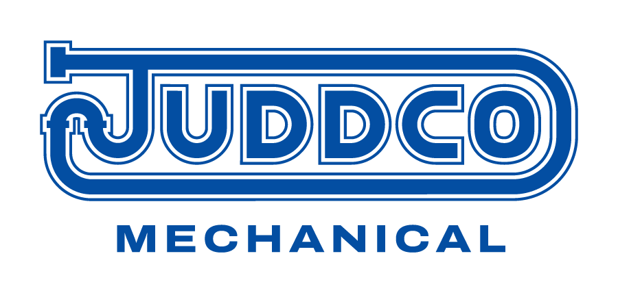
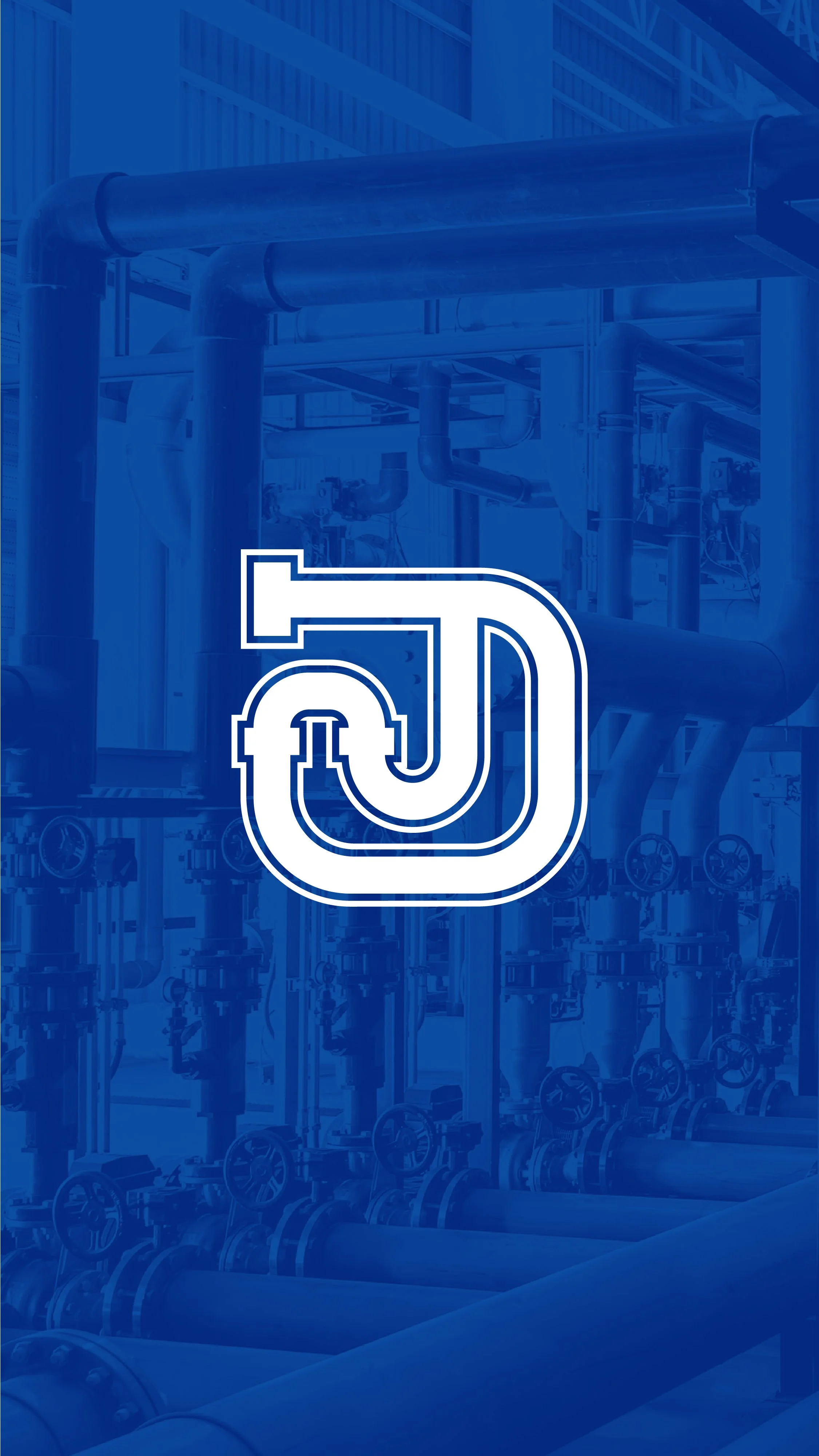
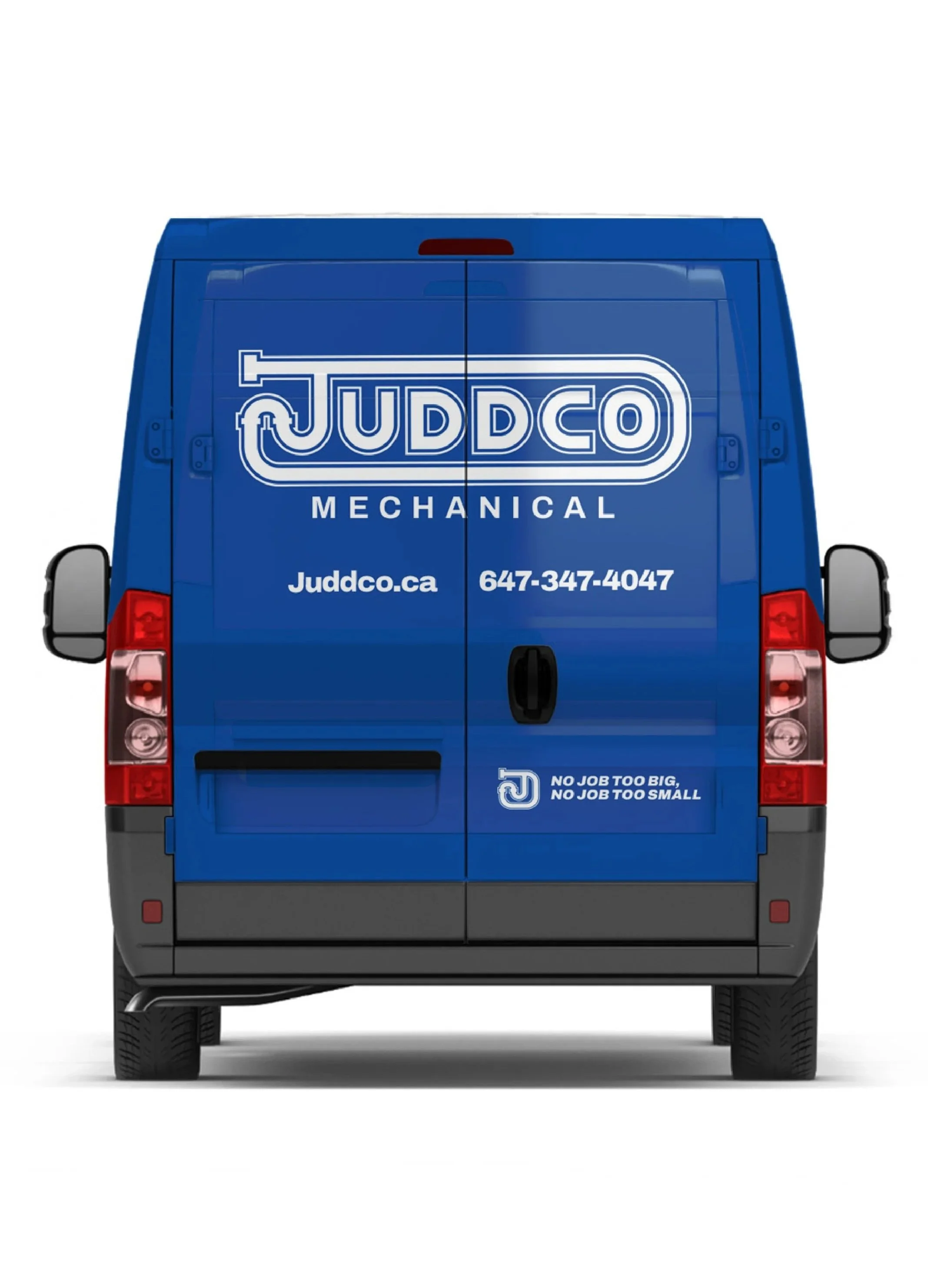
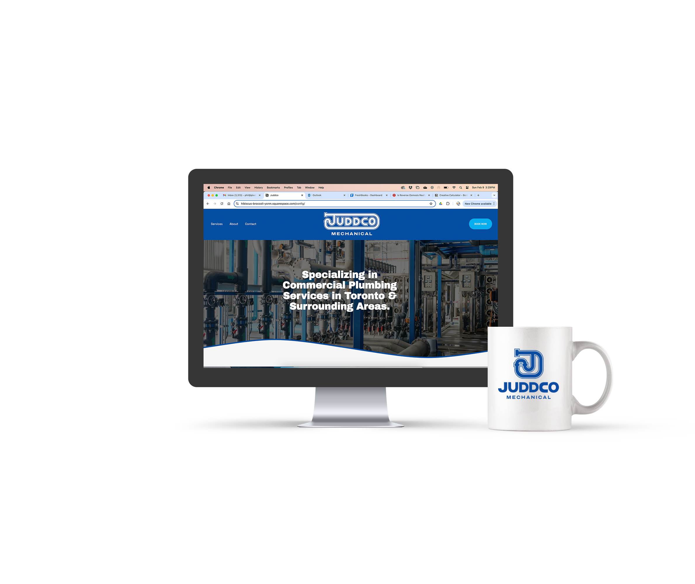
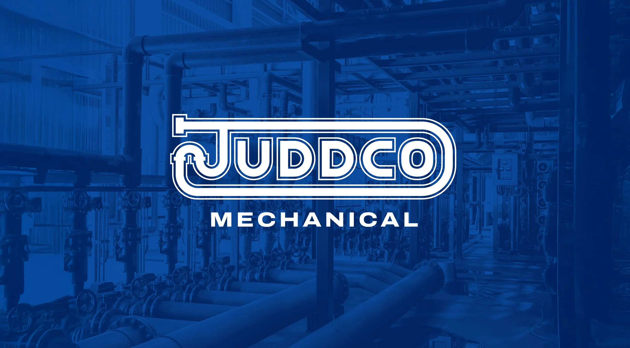
The brand was refreshed with a redesigned primary logo that maintained the pipe concept but improved legibility, boldness, and overall clarity. Additional assets were developed, including a new wordmark, an icon, and five versatile logo lockups delivered in color, black, and white for both web and print. A detailed style guide accompanied the updated identity. Further brand applications were created, such as redesigned vehicle graphics for both the service fleet and management trucks, along with a preliminary website mockup to demonstrate how the new branding translates across desktop and mobile. Upcoming steps include finalizing vehicle details for production and expanding the website with updated service information, an About page, employee photos, forms, and full site development.
Solution